Jeff Hein
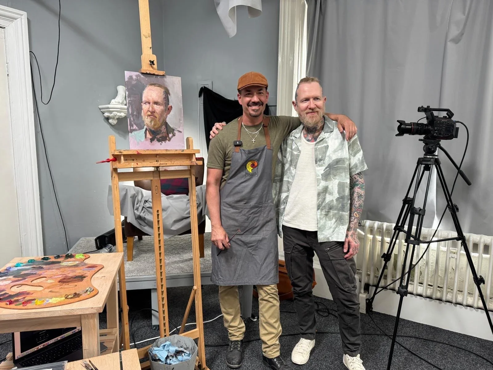
Jeff Hein is an American figurative painter and art educator known for his contemporary realist portraits and strong foundation in classical painting traditions. His work combines academic realism with expressive brushwork, focusing on the human figure, light, and emotional presence. Hein’s paintings are recognized for their dramatic lighting, rich color harmonies, and ability to capture both the physical likeness and personality of his subjects.

Influenced by 19th-century masters such as John Singer Sargent and Anders Zorn, Hein developed a style that balances technical precision with painterly freedom. His portraits often feature confident brushstrokes and carefully observed values, creating works that feel both refined and alive. Beyond portraiture, he also paints figurative compositions and landscapes that emphasize atmosphere and visual storytelling.

In addition to his studio practice, Jeff Hein is highly respected as a teacher and mentor in the contemporary realist movement. He founded the Hein Atelier of Traditional Art, where students study classical drawing and painting methods rooted in traditional atelier training. Through workshops, online instruction, and educational programs, he has helped train a new generation of representational artists.

Hein’s work has been exhibited internationally and is admired for its combination of classical craftsmanship, expressive execution, and modern sensibility. His contributions as both an artist and educator continue to shape contemporary figurative realism today.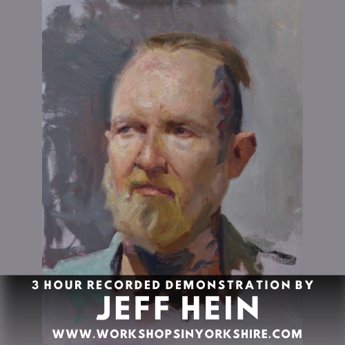

Ⓥ VEGAN
Organic – My Quinacridone Gold is made from nickel azo and quinacridone. It is organic, transparent, and has an average drying time. It also possesses excellent lightfastness and high tint power. This is a rich, amber, golden yellow that is transparent and ideal for glazing or mixing to produce interesting hues. Its shift from mass tone to undertone is pronounced, with a rich, transparent orange-brown. It’s beautiful, perfect in every way, particularly for artists who enjoy glazing or just having a crazy time with colour. You might find yourself in rehab to cure your addiction to it.

Ⓥ VEGAN
Inorganic – No. 113 is an obviously beautiful mid-blue. The discovery in the 1820s of a Sodium Sulphosilicate compound, which had appeared as a mysterious blue deposit on soda-ash furnaces, was a liberating moment for financially challenged artists everywhere. Up to then the only available version of this compound was the often-unobtainable Lapis Lazuli ore, mined in Afghanistan. Ultramarine has a high tint power, and our chosen shade produces strong green shade blue hues and makes wonderful violets with Magenta and the red Lake colours. It is also useful in greens and greys. The only chemical weakness is a recorded sensitivity to atmospherically borne acids, which can bleach it out. Ultramarine Blue is one of the more difficult paints to make, as it forms an intractable runny syrup when first ground into oil, which must then be stabilized with a small amount of wax.

Ⓥ VEGAN
Inorganic – Sometimes known as Barium Yellow, as it is Barium Chromate. It was introduced into painting after the Lead Chromates, circa 1820. Unlike Lead Chromates, though, Barium has proven permanent and non-reactive. Most colourmen consider this yellow obsolete, and Michael Harding is probably the only one still making it. By itself, it’s an acidic looking yellow with weirdly green overtones. Its low tint and covering power mix with Magenta and the cooler reds to produce modulated greys artists sometimes seek for certain passages of flesh painting. This is the only yellow chrome paint that doesn’t discolour.
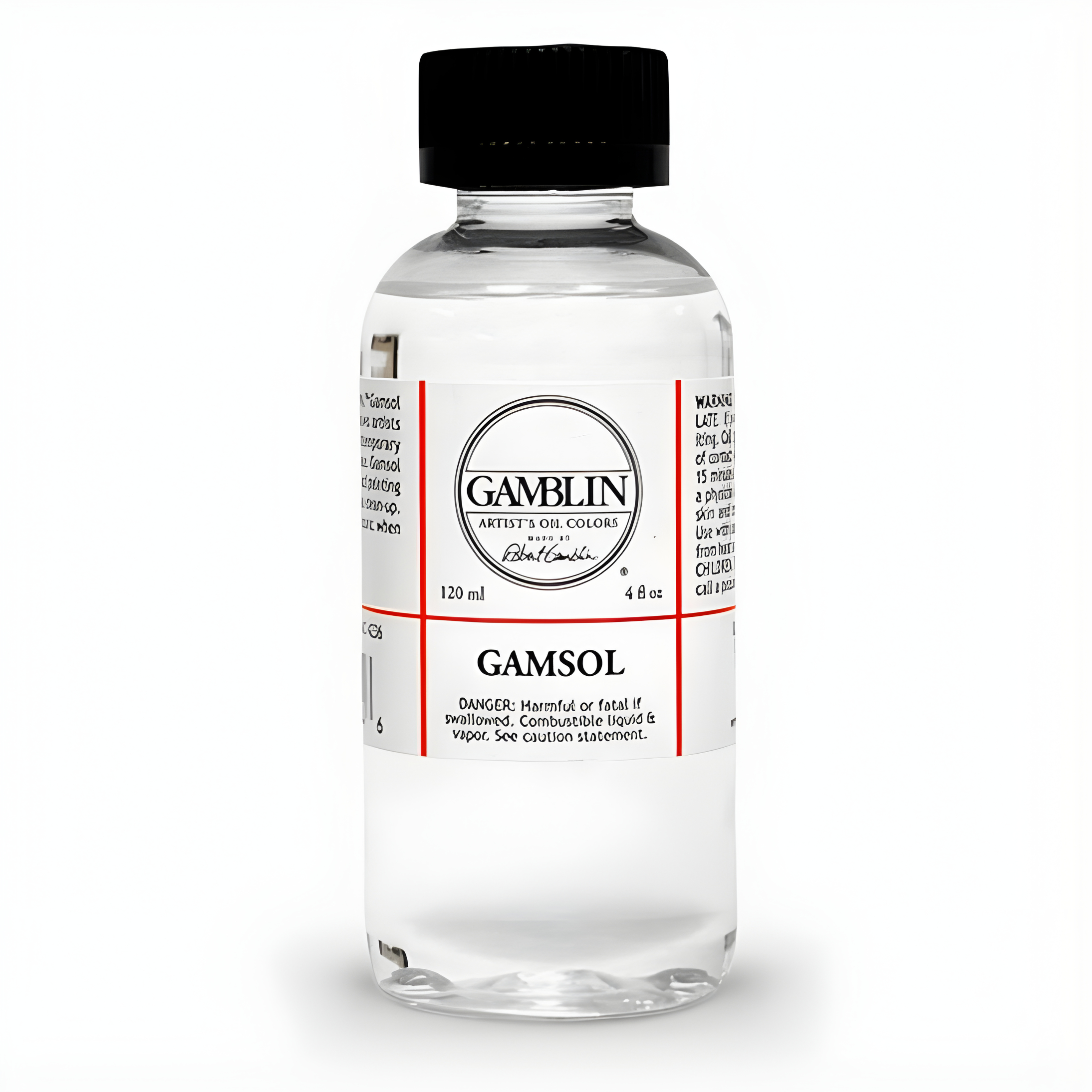
Gamsol is the safest solvent that allows oil painters to utilise all traditional painting techniques without compromise.
Primary Uses for Gamsol:
Thinning oil colours. A little goes a long way; stiff oil colours relax immediately when a little Gamsol is added. Be careful not to thin oil colours too much with solvent alone, this can compromise the ability of the paint to form a paint film.
Modifying painting mediums. Gamblin's Galkyd line of painting mediums is formulated with Gamsol, so they readily accept Gamsol as a thinning agent. Note: Gamsol should not be added to painting mediums made with natural resins (dammar, copal, mastic). They require strong solvents such as turpentine.
Studio clean up: brushes, palettes, palette knives, etc.
How does Gamsol achieve this level of performance and safety? Most solvents available to artists come from the industrial paint industry where solvent power and cheapness is prized. Gamsol is special: it is made for products and processes that come into more intimate contact with the body such as cosmetics, hand cleaners, and cleaning food service equipment.
Gamsol is a petroleum distillate but all the aromatic solvents have been refined out of it, less than .005% remains. Aromatic solvents are the most harmful types of petroleum solvents.
These facts are detailed in the MSDS for Gamsol, this document shows that it has an Exposure Limit Value higher than most solvents available to artists.
All of these factors have lead to Gamsol being used widely in oil painting classrooms; in those classes there are no solvent odours, only the wonderful smell of oil colours.
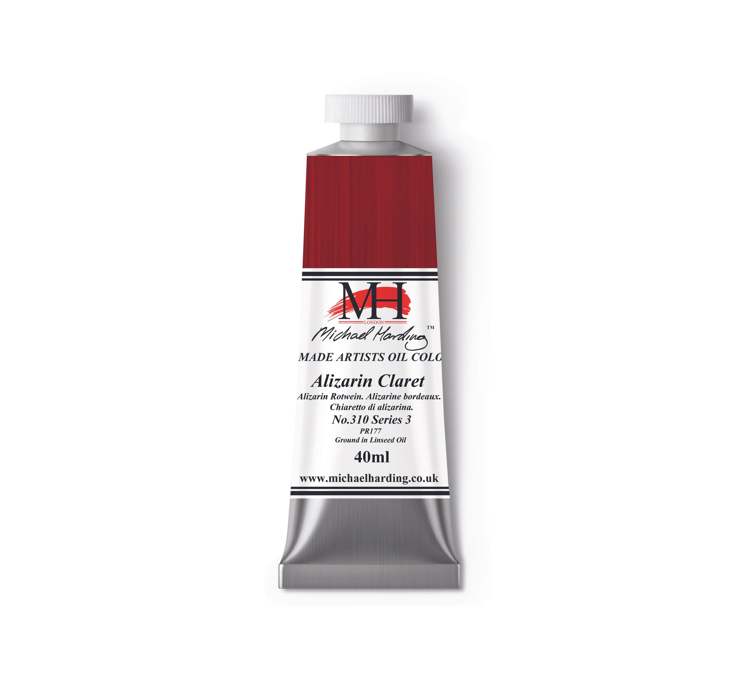
Ⓥ VEGAN
Organic – Alizarin Claret has a slightly lighter mass tone than that of Alizarin Crimson, and yet it has greater resistance to UV light than Alizarin Crimson. I specifically formulated this beautiful, full-bodied colour for those artists who are reluctant to use Alizarin Crimson. With its versatility and beautry, Alizarin Claret is perfect for portraitures, landscapes, and non-figurative works, and it’s a delight for mixing with other transparent colours.
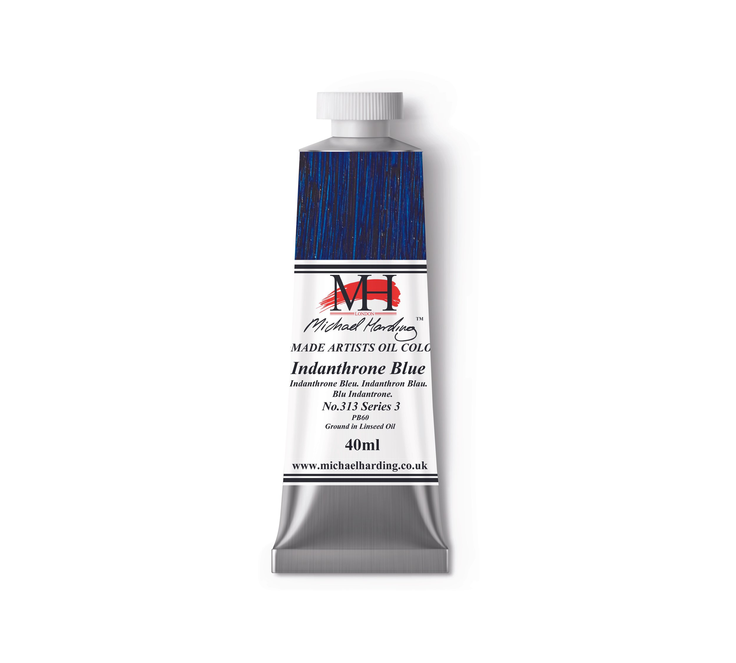
Ⓥ VEGAN
Beautiful Indanthrone Blue was invented in 1901 as a synthetic dye that resists fading. Its popularity came about because of this resistance and a need for it in the automotive industry. Michael attracted to it because it’s inky and interesting! This blue is essential for those wishing to expand their understanding of such a hypnotic shade. Blue can have a strong psychological effect on artists, from the shades of Lapis Lazuli through intense Phthalocyanines to the shade of Indanthrone Blue. When Michael recently painted a nocturn using my Indanthrone Blue, it fulfilled my needs, producing an almost narcotic effect upon him, like a poetic musical note! MH Indanthrone Blue is a strong inter-mixer. He so enjoys getting little surprises of colour when mixing with whites, yellows, and reds. Because my oil paints are not compromised by dryers, fillers, or extenders, mixing a few colours together leads to interesting colour outcomes! Try it!

Ⓥ VEGAN
Inorganic & Organic – Sap Green is a generic name for a rich, deep green. Colourmen progressively changed its composition through a variety of natural, organic lakes. This green has an exceptionally rich, earthy, even mossy range of yellow undertones that suggest all variations of vegetation and undergrowth. Permanent Sap Green is ideal for the landscape/plein air painter.

Ⓥ VEGAN
Inorganic – This Iron Oxide has been used as a wood dye, and its capacity to enrich hardwood grain makes it a wonderful candidate for paint making. It has great warmth, with gingery undertones quite different from those seen in the Indian Yellows. Because the pigment particles are small, it could almost be mistaken for a Lake. It has huge tint power that pulls whites and other yellows into a golden, rich, Titianesque zone of warm, low tones. Try it with Aureolin and the Earths.

Ⓥ VEGAN
Titanium White No. 1 is the most brilliant white in my range, suitable for crisp, cool, opaque, light shades. If you want a powerful mixer that lightens , then this is it. Although not subtle, this white is the most suitable for a bright, fresh palette. It forms a strong and durable film when cured. PW6 is an inorganic pigment.

Ⓥ VEGAN
Inorganic and Organic Pigments –Adored by the landscape painter, Pale Violet adds vibrancy to any sky. Those confusing, hard to express violet shadows we all see in clouds are now easily achievable with this colour. Pale Violet is a wonderful addition to our range of colours. It’s made from three stable, reliable, and lightfast pigments. Although these pigments are available in pure pigment form in Michael’s range, artists always tell me they can’t achieve quite the same vibrancy when mixing in their studios. Pale Violet also allows the portrait artist to achieve interesting shadow combinations—for example, as a complimentary colour to create vibrancy in greys. Pale Violet has an obvious place in still lifes and interiors. Modern artists will love it as well. Enjoy!

Ⓥ VEGAN
Inorganic – Manganese Ammonium Pyrophosphate is a bold, heavy Violet that was first made in Germany in 1868 as one of the mid-19th century wave of synthetic inorganic metal salts that prompted a change in artists’ palettes. Manganese Violet has mild, reddish overtones that do not cut through mixes and that some find useful when making reflex or shadowy greys. Its average tint power allows it to be added without greatly lowering the tonality of the result.

Ⓥ VEGAN
Inorganic – Cadmium Sulphide is a dense, lean, mid-shade warm yellow, indispensable as a foundation colour for warm mixes of all kinds.

Ⓥ VEGAN
Cadmium Green (No. 412) is a vivid colour created from pigments PY35 and PG18. With excellent lightfastness and opaque transparency, it adds depth to compositions. Its average drying speed and linseed oil binder make it a versatile choice for artists seeking reliability and vibrancy in their work.